
Tuesday, March 29, 2011
Monday, March 28, 2011
Aqua Tea

Whimsey: Another in the Floating Teapot series. My palette is everything-with-blue-in-it vs. pale yellow.
Aqua Tea is 6x6" acrylic media and collage on panel.
Sunday, March 27, 2011
Stonehenge

Blue Hillsides - We're still relishing blue. I saw these remarkable works of art in person a few years ago. They speak in lovely cubist clarity, so many centuries before cubism caught on!
Stonehenge is 8x8" acrylic media and collage on panel.
Friday, March 25, 2011
Blue Moonlight I

Series: Counter-intuitively, I am finding that doing a series actually can lead to more interesting paintings. Because you've done a given setup before, the novelty isn't keeping you on the edge of your seat. So you have to try some new crazy thing - to avoid boredom. Also, since you know you're going to do a version of this painting again, so why not experiment with this one?
Blue Moonlight I is 6x6" acrylic media and collage on panel.
Thursday, March 24, 2011

Monday, March 21, 2011
Blue Moonlight

Don't Bore Me! Painter Sergei Bongart is quoted as having said "Anything in art is forgivable - except being boring!" I want to try to keep this in mind. I think avoiding boringness may actually be a source of courage! When you tinker with a new thing in a painting, and then shut yourself down with "oh, that won't work", maybe you're allowing fear to creep in. I remember watching the wonderful Ratindra Das doing a demo in watercolor. He was slinging all kinds of colors around, one color slash right over another, and he'd say :"What am I doing? I'm just entertaining myself here!" And his paintings are so exciting! So...I'm searching for courage in boredom-banishment!
Blue Moonlight is 6x6" acrylic media and collage on panel.

Saturday, March 19, 2011

Thursday, March 17, 2011
Blue Gold

Water your creative spirit - In her new book "Art at the Speed of Life", Pam Carriker says that if you don't water your creative spirit every day, it can begin to wilt. She gives tips for doing a manageable amount of art each day to keep yourself nourished. Over time, your efforts accumulate into a nice statement.
Here I've made another in the Floating Teapot series. This time I've justaposed blue toward blue-violet, and added yellow-green. Composition is still fanciful!
Aqua Tea is 6x6" acrylic media and collage on panel.
Wednesday, March 16, 2011
Artifacts of an Imagined Time

Creative Destruction - Well, this went through a lot of iterations. Make it and break it.
Artifacts of an Imagined Time is 8x8" acrylic media and collage on panel.
Monday, March 14, 2011
Fallbrook Hillside

Contradictions: In his classic and much-quoted book "Complete Guide to Watercolor Painting", Edgar Whitney discusses the Principles of Design. They are : Unity and Conflict. Repetition and Alternation. Dominance and Harmony. Balance and Gradation. Wait...what? Don't a lot of these utterly contradict one another? I have puzzled this for a while. Are we supposed to use them all in each painting? Or chose one from each contradictory pair? Neither he nor his followers tells you. Hmmm. Painting is a mystery. But surely we can come up with way to use these to produce magic. Beauty.
Fallbrook Hillside is 8x8" acrylic media and collage on panel.
Friday, March 11, 2011
Bird Call

Birds of Spring: Another in my bird series, this time with blue vs. yellow-orange. I sometimes feel blue can be a little cold. But if you push it so it's part warm blue, and mix in a lovely warm yellow, it feels more upbeat. I wanted this to feel like spring.
Bird Call is 8x8" acrylic media and collage on panel.
Monday, March 7, 2011
There's Music in the Air!
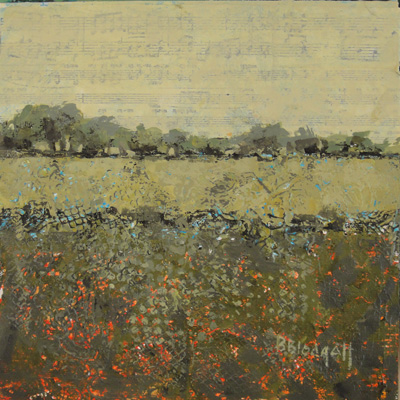
Texture: I decided to try a new series, Across the Meadow, emphasizing texture. Goal: Arresting texture, simple yet elegant high-horizon composition. If the surface is going to be complex, let's simplify the design. I gessoed the panel pretty thickly and pressed into it some lace from my grandmother, as well as some grid materials from various cast-off athletic bags. Let the gesso firm up a bit, and then pull the items out of it before they're stuck. Let dry. Next drizzle acrylic ink over it to fill in the puddles. Then paint very dry-brush over to draw out the texture patterns. It is like having written in invisible ink, and then making your text reappear! I love texture. But it doesn't mean I don't have to compose. Here I've tried a high horizon and broken the meadow into passages that are different in value and temperature. Green shows off beautifully if you push it cooler and then push it warmer.
There's Music in the Air! is 8x8" Acrylic media on panel.
Thursday, March 3, 2011
Path to the Lake

Simplify: My friend, who is numerically gifted, frowned upon hearing I was spending 8 hours to make the 6x6" paintings, and 12 hours to make the 8x8" paintings. The idea of Daily Painting is to complete a painting in 30 minutes to an hour. "You have missed the point here. You need to simplify", she concluded. You know, Say One Thing. So I have attempted to pare down what's happening here.
Path to the Lake is 6x6" acrylic media and collage on panel.
Path to the Lake is 6x6" acrylic media and collage on panel.
Tuesday, March 1, 2011
Wine Dark Sea

Wine Dark Sea is 11x15" Acrylic Media and Collage on watercolor paper.
Subscribe to:
Comments (Atom)